Brand decisions
What was decided about Poulpy and the brand, why, and when. The brand page and the brand book say what Poulpy is today; this page keeps the reasons, so a later change can see what it overturns. Architecture decisions live in docs/adr/ instead.
Add a decision here in the same PR as the brand change it explains, newest at the bottom. When a decision is overturned, keep it, mark it superseded and link the one that replaces it.
1. Logo A: the plush as he is
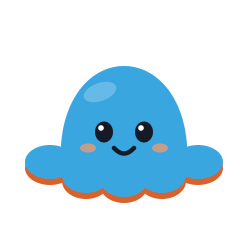
Accepted, 24 October 2026. The logo is a faithful front view of the plush: tall dome, five visible arms and the ember lining peeking out underneath. The logo and the in-app mascot are the same drawing.
Why: it is Poulpy himself, the one real plush the app is built around, and one drawing for both keeps him recognisable everywhere.
Set aside: B, Poulpy split down the middle with one happy and one grumpy half; C, a letter P made from his head and a curled arm.
2. Baloo 2 for headings, Nunito for text
Accepted, 24 October 2026. Baloo 2 for headings, Poulpy's speech and big moments; Nunito for body text, labels and numbers.
Why: both are round like the plush, and both are free (SIL Open Font License), so they ship inside the apps and load from Google Fonts on the web. Nunito has tabular figures, so timers and rep counts don't jitter while they tick.
3. The grumpy side is ember, not pink
Accepted, 24 October 2026. The real plush's grumpy side is pink; in the brand it is ember, from burnt orange to red, and the lining under the blue side follows it. Errors move to a crimson (#C8264A) and always carry an icon and text.
Why: the owner wanted a grumpy side that reads redder and less pink. Crimson errors with an icon keep a cross Poulpy from ever being mistaken for an error.
4. Burnt orange is the ember
Accepted, 24 October 2026. The everyday grumpy shade is burnt orange, #D9622B. Buttons use the deeper ember 600 (#B4471C), because the plush ember is too light for white text.
Why: warm, playful and clearly not an error, and it has room to deepen into red for Fuming.
Set aside: brick (#C2452D), moodier and with less room to go redder; vermilion (#E4572E), loud and the closest to a warning colour.
5. The side is the status, the shade is the feeling
Accepted, 24 October 2026. Which side shows says whether you are keeping your plan; the shade on that side moves with what just happened.
Why: the owner asked for shades that change with accomplishments and emotions, and real octopuses change colour with their mood.
6. Six moods, three blues, no grey
Accepted, 24 October 2026. The spectrum is Proud, Happy and Recovering on the blue side; Annoyed, Grumpy and Fuming on the ember side. Tired, Calm and rest merged into one light blue, Recovering. Proud sits just next to Happy.
Why: the first spectrum's grey Tired felt uneasy, even sick, and there were too many blues. Proud read too far from Poulpy's own colour.
7. No hearts; a grace period instead
Accepted, 24 October 2026. The "three hearts a month" idea, which let you miss sessions without Poulpy turning grumpy, is dropped. Instead a session still due by the evening only makes Poulpy Annoyed, and he turns Grumpy 24 hours after its day.
Why: the owner kept every game idea except the hearts. The grace period gives the same slack without something to count down.
8. Poulpy never lifts his tentacles
Accepted, 24 October 2026. Every pose keeps the plush's shape and shows the mood with his face, shade, props and small effects. The poses that needed arms were renamed for what they show: Flexing became Cocky, Lifting became Straining, Hiding his eyes became Shy, Head scratch became Thinking and Arms crossed became Pouting.
Why: Poulpy has eight tentacles and no arms, so the first poses with added arms were wrong. Lifting his own tentacles was tried next, first long, then cut to the plush's real length, and still didn't look like him.
9. Poses follow the real plush
Accepted, 24 October 2026. The pose sheet stays close to how the plush actually sits and moves:
- Standing tall, Side glance, Shy, Thinking and Spinning come from photos of the plush.
- Standing tall is the usual plush with the base of his tentacles slightly stretched, with no gaps.
- Spinning, the loading indicator, is drawn comic-style with motion lines, and only the front arc moves.
- Champion has no arms, Sleeping has a short upright nightcap and no bed, Patched up has no bubble, and Exhausted has no puddle.
Why: each was a correction from the owner. The first Standing tall showed gaps around his body, and the first Spinning flattened him like a card instead of turning him.
10. Colours generated from one tokens file
Accepted, 24 October 2026. Once the colours were validated, they went into design/tokens.json and are generated into each platform's theme. See ADR 0012.
11. Tentacles never reset
Accepted, 24 October 2026. Each finished session lights one of the eight tentacles, and a lit tentacle never goes dark. The eighth makes a full octopus and the next session starts a new ring. This replaces "eight tentacles a week", where the ring emptied every Monday.
Why: eight sessions a week is a lot, and a weekly reset punishes the people who train least. A ring that only fills keeps Poulpy positive for them.
12. The ember-side rules
Accepted, 26 October 2026, for #17. The brand page sets when Poulpy turns ember. Annoyed runs from 18:00 on an entry's day to the end of the next day; the entry is missed after that, which makes him Grumpy, and two missed entries make him Fuming. Only plan calendar entries count, never planned workouts placed by hand. Skipped entries never count. Any finished session forgives every entry dated on or before its day. Entries inside a 72 h pain or rehab window never count. The catch-up is the plan's shortest workout and leaves missed entries as they are.
Why: decision 7 promised a grace period "until 24 hours after its day", and reading it as the whole next day gives a person who trains in the morning a real second chance. Counting only what is still planned keeps the ember side for sessions left hanging, not for honest choices: a skip, a move, a rest day or pain. Forgiving by date rather than by matching each entry keeps "any finished session flips him straight back" literally true.
Set aside: a skip counting as missed, which makes skipping feel like a confession; the catch-up marking a missed entry done, which rewrites History.
13. Inclusive by default
Accepted, 1 November 2026. The owner wants the app to be LGBTQ+ friendly as part of the brand. The brand page turns that into rules: optional fields with a stated reason, Sex assigned at birth asked only where an estimate needs it, pronouns as a separate field, neutral wording, no body judgement.
Why: "sex assigned at birth" is the wording most inclusive-forms guides recommend for a physiological question, because it describes what was recorded rather than who someone is, and it keeps gender out of it; "biological sex" and "birth sex" read as defining a person and are the terms trans and intersex people most often object to. The app also needs no gender at all: sex assigned at birth drives estimates, and pronouns drive wording.
Set aside: one "Gender" field with Male, Female and Other (which mixes the two questions and makes "Other" the label for everyone outside two boxes); free-text sex (cannot feed an estimate); asking nothing (the estimates become less accurate for people who are happy to say). The wording was chosen from published guides and has not yet been read by LGBTQ+ people: that read is still to do, and the wording changes if it asks for it.